
We're going to be building a navigation bar in Figma.
I'll walk you through wireframing, taking the design to the next stage, and ultimately building a navigation bar ready to hand off to developers or develop yourself.
We'll also discuss responsive design and how to adapt your desktop navigation bar for smaller screens and mobile devices.
The navigation bar is arguably the most essential part of your webpage.
It helps users find what they're looking for and can ultimately help convert them into customers.
Therefore, designers need to grasp this concept.
Getting Started in Figma
So here we are in Figma.
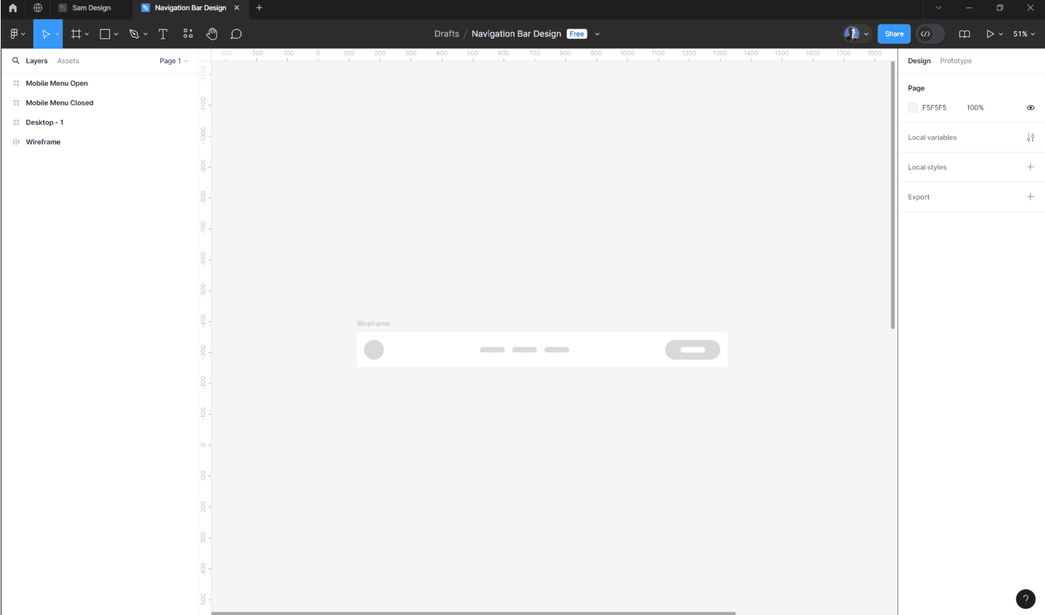
I've opened a brand-new design file and, to speed things up, put together a very simple wireframe.
For those of you who are new to Figma, it is a collaborative, cloud-based design tool that has quickly become the industry standard for many applications—from website design to social media graphics and email design. Figma simplifies the design process and promotes collaboration not only among designers but also with clients.
A wireframe is a fundamental and easy-to-assemble design that helps you understand the structure and layout of your final project.
Wireframes are particularly useful for user experience designers to see how the final application will work for users.
This wireframe has the logo on the left-hand side, three easy-to-use links in the middle, and a button on the right-hand side.
The design is spacious, clean, and recognisable.
Building the Design
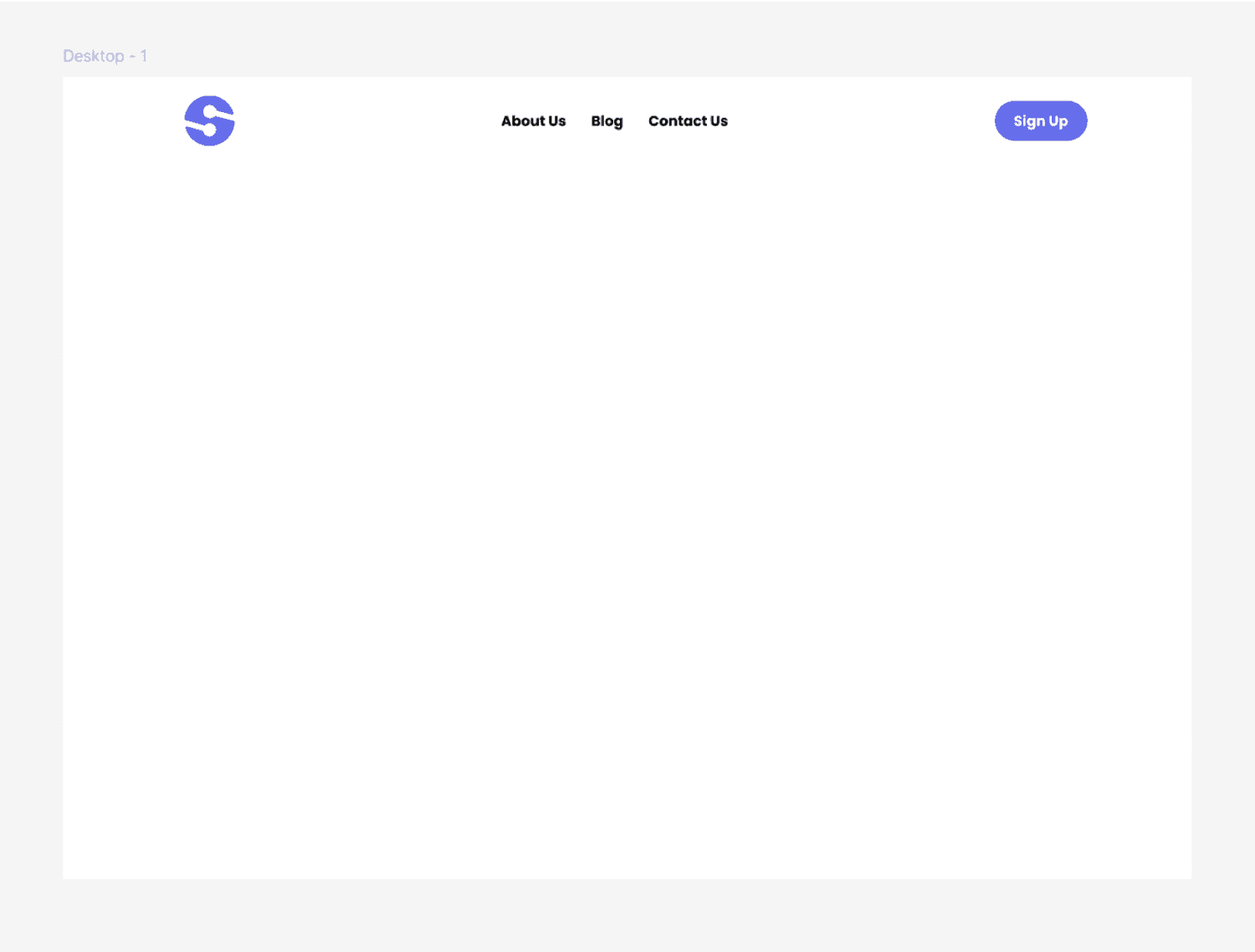
To build our design, we add a frame—the foundation for any project in Figma.
You can do this by clicking on the "frame" icon at the top or pressing your keyboard's 'F' key.
Next, select the size of the frame suitable for a desktop landing page. Under the 'Design' panel and the 'Desktop' dropdown, select 'Desktop' to create a frame of the right size for a desktop design.
Next, we'll add another frame within our desktop frame for the navigation bar, making it 1200 pixels wide.
Align it to the top of the desktop frame.
It's time to start adding the elements based on the wireframe.
Drag the logo into the navigation bar frame.
Minimise the wireframe in the layers panel for clarity.
So far, you should have the desktop on the outside, the navigation bar inside that, and the logo inside the navigation bar.
Press the 'T' key on your keyboard to add three text blocks for the links: 'About Us', 'Blog', and 'Contact Us'.
Duplicate these text layers by holding down 'Alt' and clicking and dragging.
Finally, add your button to the right-hand side.
Start with the text layer for the button's label (e.g., 'Sign Up'), then wrap it with a frame to act as the button's background.
This frame can automatically adjust its width and height based on the content.
With all elements in place—logo, links, and button—the next step is to structure them correctly within the navigation bar.
Structuring and Aligning Elements
To structure the elements, we'll use Figma's auto-layout feature.
Select the navigation bar frame and add auto-layout, setting it to 'Horizontal'.
Doing so will space the elements evenly and keep the layout neat.
Adjust the padding and spacing to create a balanced look.
Once done, rename the layers for better organisation: 'Logo', 'Nav Links', and 'Button'.
Responsive Design for Mobile
Now, let's talk about responsive design for mobile.
Start by duplicating the desktop frame and adjusting its size to match a mobile phone.
Mobile navigation typically uses a 'hamburger' icon to hide the menu until clicked.
So, create two frames: one for the closed menu and one for the open menu.
Only the logo and hamburger icon will be visible in the closed menu.
In the open menu, display the navigation links and button.
Rotate the hamburger icon lines to create a close icon, then adjust the vertical layout direction of the navigation links.
Ensure the button takes up the entire frame width for easier clicking.
Prototyping the Navigation Bar
To advance your design, you can explore prototyping in Figma.
In the prototype panel, link the hamburger icon to the open menu frame and the close icon back to the closed menu frame.
This interaction will show how the navigation menu transitions between open and closed states.
Conclusion
And there you have it!
That's how to build a basic but functional navigation bar in Figma.
This design can be adapted to suit both desktop and mobile devices, ensuring responsive behaviour across different screen sizes.
If you're interested in learning how to develop this navigation bar in Framer or Webflow, let me know in the comments below.
Thanks for reading, and please subscribe to the channel to stay updated on future tutorials.
See you in the next post!


