What Web & UI Design Trends can we expect to see in 2024?
Over the years, website and user interface design styles have significantly developed.
We have seen complex, realistic material designs moved aside in place of flat, often cartoonish styles.
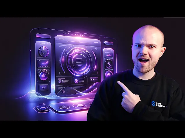
In 2024, we have gone full circle and will, once again, see a rise in material-like designs with depth and elements of realism.
Let's look at the most recent digital landscape trends, from bento boxes and vibrant neon gradients to massive 60s-style serif fonts and glass morphism.
Vibrant Neon Gradients and Colours
Website designs, like that of Stripe, have paved the way for more complex gradient styles to be at the forefront of graphic design trends.
From noisy gradients, to animated, moving gradients, they have proven to be an engaging, expensive look for UI designs.
While the web becomes simplified for easier use, and designs become increasingly minimal and spacious, gradients act as a saving grace - bringing excitement and a burst of colour to otherwise bland designs.
60s Style Serif Fonts, but Massive.
I said we have gone full circle, and this is precisely how!
Design trends point to a shift to 60s style font choices, often stretched across the entire screen.
Design is reactionary.
One trend comes, and another follows.
Similarly to how bold, colourful gradients are breaking free of minimalism's blandness, font choices have been modernist, sans-serif and relatively lifeless for a long time.
In reaction to this, the font choices of UI designers are once again leaning on serif, exciting, playful and characteristic typefaces.
An end to flat UI design?
Just as fonts are moving away from modern simplicity, design is changing.
Flat UI design has been at the forefront of UI and website design for a long time.
Essentially, flat design is minimalism defined.
Often, you'll see no gradients, shadows, borders or anything that adds visual complexity in any form with a flat UI design.
In reaction, we see a rise in glowing effects, shadows, and borders that mimic real-world materials.
Design styles will shift throughout the year to include greater depth and move away from the beloved flat style.
The question is, will this shift the barrier of entry for designers?
Flat UI design is so minimal and simple that it is accessible for designers of varying abilities.
Will more complex design styles with depth see fewer people capable of keeping up with the design trends?
Glassmorphism, Skeuomorphism, and Material Design
If you follow UI design trends, you will likely have heard of material design, glass morphism, and skeuomorphism.
All three design styles rely on real-world interactions between surfaces and materials and the environment and lighting.
For example, glassmorphism in design describes a style which often sees a frosted glass effect used with blurry background elements and sometimes even a slight reflective quality.
Skeuomorphism and material design styles lean on shadows and create the illusion of depth in your design layers.
This could be using a subtle shadow on a box on a landing page to create the effect that it is further forward than the page itself.
Material design also relies on colours other than pure black or pure white, sometimes in conjunction with a slight graininess or noise, to create surfaces that appear more realistic and less flat.
Bento Box Card-Based Layouts
Bento boxes are a buzzword in the design industry.
They are arguably one of the most significant and most noticeable trends in UI design of 2024.
Apple and other major websites feature these card-like bento box layouts, which use grids to create attractive, visually appealing collections of information.
The term has become so attractive to designers that it is, without a doubt, a significant trend for website designs this year.
Elevated Interactivity and Motion
Interactive websites often see higher conversion rates.
Moving your mouse around on a page and making something change that is visually exciting keeps you on a website for longer.
The more time a user is excited by a website and stays there, the more likely the chance that the user will convert into a customer or sign up for a service.
Beyond hover effects, animations and motion are vital players in user retention and creating excitement in website user interface designs.
It makes sense to employ more significant use of motion and animation in your designs, and it is a definite trend we can expect to see this year.
Simplification of Copy and Content
People consume a LOT of media each day.
Most people spend at least some time interacting with digital content, from social media scrolls to search engine results and websites.
With this, attention spans have seemingly vanished!
You must convey a message in seconds to reach and engage anyone.
Say hello to the simplified web.
Copy and content are about to get much simpler and more accessible for users to digest quickly.
This could mean reduced word count or new approaches to layouts.
One thing is for sure: users need content to be simple and easy to understand.
AI-Generated Imagery
AI has changed a tonne in the past year alone.
Websites across the web are now using content produced by the likes of OpenAI's Chat-GPT and other AI models.
A user can input a text prompt, and in no time at all, an entire article gets written, or an image that never existed gets made.
When designing prototypes or mockup websites, this is a designer's dream as you can quickly populate a website with imagery and content without using dummy text or writing it yourself.
But is this something to be concerned about?
AI could mean we are about to see a significant increase in difficulty deciphering what is real and what is generated.
One thing is sure: websites are about to feature AI-generated content more frequently.
Summary: UI Design Trends for 2024
In summary, 2024 is about to see a lot of design trends focused on a shift away from simple, flat UI styles towards exciting, moving designs with layers and depth.
From bento grids to simplified content, we are about to see a shift to make the web more accessible to use quickly.
While the web is about to become more colourful and playful in its design choices, a great deal of content will likely be entirely machine-generated for the first time in history, even if it still has a long time to go.


